Sunday, July 15, 2007

McDonalds Sucks....

Brilliant...i just wrote a blog on here just aminute ago bragging about how McDonalds has a new burger that is edible, so i went to the site to name said burger, and the lovely link opened up in the window that i had my blog in....SO McDONALDS CAN KISS MY ARSE...because despite how atomically awesome their burgers are, they are not getting any free advertising out of me! (rofl at the irony)

Anyway, in my earlier blog, i went on to talk about Anime! and how little i have been doing over the holidays, although i tried to fool u all in the original blog by telling u that i had been busy busy.... rofl!!
in actual fact all i have been doing all holidays is playing games and watching anime, occasionally i would clean the house and move the furniture around...but mostly i have been doing a lot of sitting on my butt eating fatty junk food! woot! What else are the holidays for!?!!
Whilst 'studying' the anime mentioned previously i had a lovely conversation with my 'partner' ( XD ) Beaux, it went something like this....
*clears throat*
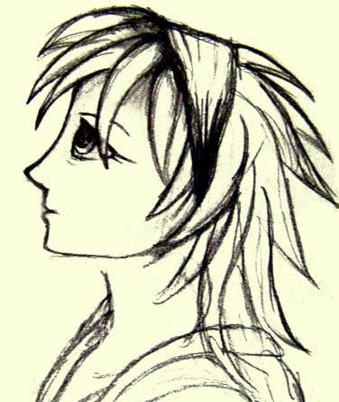
Me: "Anime doesnt really look all that hard to draw, i wonder if i could do it"
Beaux: "No way! u wouldnt be able to, your style is way too different"
Me: "aww what!! u dont think i could do it?"
Beaux: " NO! "
(although this was all in fun)
And i set out to prove my dearest Beaux wrong .... and here are the results:
my first attempt:

my most recent attempt:


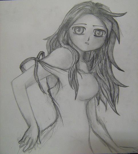
I dont think they turned out too terrible, do u? please leave comments :-)

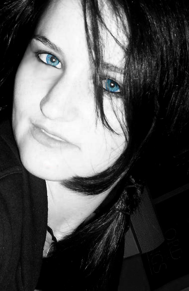
I also went home last weekend, to visit my little sarah and see her for the weekend before her birthday (in actual fact, its her birthday today! so everybody say happy birthday to her!!!).
After spending the whole day on Saturday together going clothes shopping and buying various things that we didnt overly need, we went out to the Pastrol that night with a whole stack of friends! it was a really good night, Sarah seems to think that the whole entire night sucked because Vince wasnt there, so Vince u'd better look out! ur in twouble. But Sarah, if you're reading this - it was a great night out! If it wasnt for you being drunk and Chris being a sleeze, it would have worked out fine in the end!
And now for some pictures as proof of how fun it was!!!


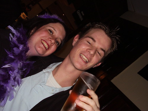
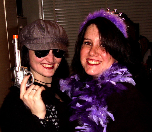
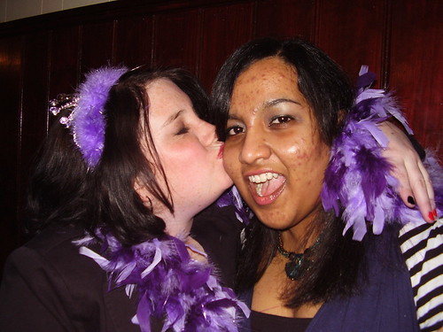
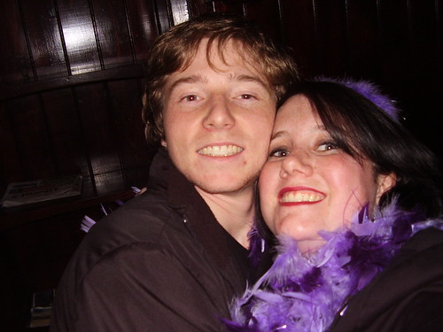
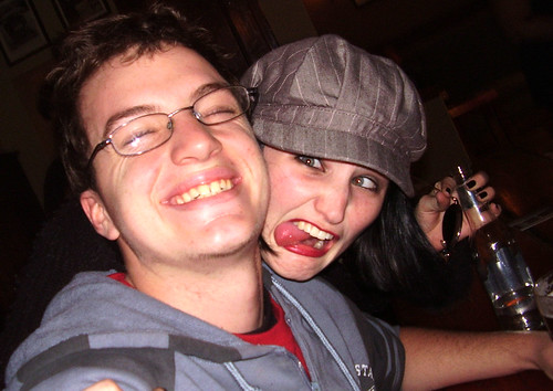
SEE!!! now, u tell me that u dont look like ur having fun little miss birthday girl!
:-) *hugs and love!!*

Beaux and I heading to Sydney this weekend to see Val and Jon... We leave thursday and come back on Monday! :-D Coz it Beaux's long weekend! yay! Im so excited and i cant wait! The good thing about missing people so much, is when the holidays are here, u can go and see everyone all at once... its like jumping into a big pool of soft, chewy marshmallows! :-D

Thats the latest in Pam News, I am Pam Readford, Goodnight Australia.

Wednesday, June 13, 2007

Visitors To My Blog...

Okay, well...I had a counter from some random free counter site, i put it here for my last assessment, but since then it hasnt been working. so i thought, screw that! and signed up for a different free counter site, this one has actual membership and seems to be a bit better organised that the previous one.
I signed up for Bravenet
so if there were any questions as to why my counter has little to no visits, its because i've only just recently added it. I'm not really a nigel :-(

MPI104 Assessment #2

Well, its nearing the end of the term, and its time to write another assessment blog.
So im going to start off by talking about the aesthetics of my blogspot, which is the site you are viewing now. :-)
I originally had a black background, and the default template of 'Minima Dark', but due to its utter boringness I customized my blog. The header that you see, entitled "Pams Jibberish" is made by me in photoshop, all the pictures and drawings etc are all my original artworks and sketches. To get the sizing right, i took a screen shot of my site and cut around the border so i had a canvas the right size for my header :-) After i made my header i changed the background and font colours to match it, I think overall my blog looks nice and professional, and clean. Which i think is important for any website. It gives it a more wecoming feeling and hence improves its interestingness.
Throughout my blogs i try to keep a consistant amount of links and pictures and little clicky bits to excite and entice the readers of my blog. That being said, You may have noticed the large date gab between posts, between the picture of my nephew and my pictures on aesthetics. I have a very good explanation for this. Animation. It really is a very hard subject to do and maintain attention on all other subjects. And just to take every opportunity: If you want to veiw what i have actually been working on, Click here
I have included a counter on my blog, which was there last assessment, i have a variety of links down the side such as Fav Music News and Animation News, also an RSS feed down the bottom of my delicious links.
For all of my accounts, Flickr, Delicious and Technorati (Rank: 343249) I have tried to make them as interesting as possible. I have a range of images uploaded to my flickr account, and ive gradually been adding them, which im quite happy about, i have over 30 images which is the minimum amount needed for ths assessment. My Delicious account has 3 pages of links, which is also the right amount! (and i havnt even had to add any extra today!). And My technorati has the Multimedia Arts Metablog added to my favourites which is what i needed :-)
For the sake of interestingness (although i dont know how interesting i can be) I have included a snap shot of me as im currently writing this blog! I'm in bed on my new laptop, wearing my dressing gown and hat for i am freezing cold! And it was a good way to test the inbuilt camera on my lappy! hehehe.
Anyway, back to writing a blog about passing(hopefully) this subject.
I've fixed my webcounter up, ive had a few errors with it... as stated previously.
OKay...so I've talked about my 3 accounts (flickr, delicious, and technorati) and I've also spoken about the aesthetics of my blog. I think that its all said, and overwith, so I'll end this blog!
Wish Me Luck!

Aesthetics & Squiggly Bits Screen Shots

Previously i posted about Aesthetis and Squiggly Bits... here are some images of the sites mentioned:
Bitey Castle:

The Worlds Worst Website:

And Lissa Explains:
I was a bit slack for not posting these at the same time.. but im sure i'll be forgiven.?

Sunday, May 27, 2007

Gregory


Just posting a photo for my sister to have a look at. :-D
This is my nephew Gregory playing in my backyard in Dubbo. Isn't he gorgeous! ^_^
I took this a couple of weeks ago when i went home for the weekend... oh, i love my camera *hugs it*..oh and i love my nephew too!! *hugs him too*

Wednesday, May 23, 2007

Technorati

I think i've claimed my blog. i dont fully understand what technorati is, but im sure i'll find that out tomorrow!
anyways, heres a link to my Technorati Profile.
have fun!

Monday, May 21, 2007

Squiggly Bits, Aesthetics & Interestingness

In MPI104 last week we learnt French! According to Jo the word 'serif' means 'squiggly bits', and 'sans serif' means 'without squiggly bits'. Of course we're talking in means of fonts! For example...

this would be a serif font
whereas this would be a sans serif font

I apologise for the appauling example. i couldnt be bothered changing the fonts and stuff... so i cheated and used italics and bolding. lol.
but hopefully you get what i mean!
According to my year 11 & 12 IT Teacher Mrs McKenzie(just proves that maybe i did pay attention to her raving madness) sans serif fonts are harder to read because they have individual blocks, whereas serif fonts are easier to read because each letter flows to the next.


In regards to aesthetics and websites, I personally like the Bitey Castle . It has a nice opening page, where you click the image to enter. All of the links on the main site are clearly labelled, and down the left column there are animated .gif links, which i think is pretty cool too. There are links to the sites that Adam Phillips, the artist of the bitey animations visits on a regular basis. Considering bandwidth, this site may be a little hard to load, although I am on a slow dial up speed with a crap computer and it still works quite well for me. He's done a smart thing and put each different animation on a different page, so it doesn't take ages to load the page if you're not going to watch the animations. So hes got a big chain of pages that link together (just like a diagram on front page *cringes* i hate that program) which is why i applaud modern technology! lol gone are the days when one must have everything stuck on the one page, and have no exciting colour or pictures- very gross. lol.


Speaking of gross, how about we check out a really badly done website.

For a laugh lets pick on The Worlds Worst Website. And its not a joke, that is the actual title of the website. lol. It just makes me cringe at the basic html that some people use and get away with. This site is good in regards to teaching people lessons! It does actually tell you what is and is not acceptable and what should and should not be done.
This actually brings me to another good site, Lissa Explains its a site that allowed me to steal html codes when i was creating my own websites. This site itself is aesthetically pleasing which is actually quite encouraging to the person who wishes to learn html. "oh this site is nice, it looks like this person knows what they're doing. lets learn from them." well that's kind of how i felt when i was a quivering year 8 student who had never used html before. And it helped too. yay!

Okay, so.... that being said...what makes a good website?
the aim of the website always needs to be taken into consideration, for example, the guys who made The Worlds Worst Website, made it like that on purpose to demonstrate some horrible mistakes people make when building websites, whereas Lissa explains was trying to show off its style to appeal to html and java scripting learners.
blah blah blah websites are so much fun, and they look good and blah.

Writing that is easy to read is always good, for example, if you have bright pink writing on a red background or even a fluro yellow background...it begins to get a bit painful to focus on and one must highlight each word to be able to read it successfully. not good!
Web buttons are pretty nifty and make everything look spiff! That is why i like the Bitey Castle so much, he has made his own web buttons, and has made them animated which heightens the appeal and aesthetics of the site as a whole.

For now, i am over analyzing websites and finding attractive things about pixels. so im going to depart. hope you enjoyed my long and tedious blog.
Thankyou